
The Power of Colour Psychology in Branding: Attracting the Right Audience for Your Business
Colour is often the very first visual cue a potential customer notices about your brand. Long before someone reads your tagline, explores your services, or reviews your pricing, their brain makes a subconscious assessment based entirely on your visual palette. In fact, research in consumer psychology indicates that up to 90% of initial product judgments are based on colour alone.
Choosing the right colours for your business is not merely an aesthetic exercise—it is a foundational marketing strategy. When applied intentionally, brand colours communicate your core values, signal your industry authority, and establish an immediate emotional connection with your dream clients. Conversely, selecting the wrong colour palette can misalign customer expectations, project amateurism, or attract leads who are looking for a completely different service experience.
Basic Colours, Metallics, and Neutrals: What They Mean and Who They Attract
Every colour family triggers distinct psychological responses. The table below breaks down the fundamental primary, secondary, neutral, and metallic tones, highlighting what they signal and the specific audiences they naturally draw in.
Psychological Meaning & Perception: Trust, dependability, security, professionalism, calm
Audience & Market Attracted: Corporate clients, B2B decision-makers, financial & tech users, healthcare patients
Psychological Meaning & Perception: Urgency, passion, energy, excitement, bold action
Audience & Market Attracted: Impulse buyers, youth demographics, food & dining consumers, fitness enthusiasts
Psychological Meaning & Perception: Growth, health, vitality, balance, sustainability, wealth
Audience & Market Attracted: Eco-conscious shoppers, wellness seekers, investors, agricultural & organic buyers
Psychological Meaning & Perception: Optimism, clarity, warmth, creativity, friendliness
Audience & Market Attracted: Value-conscious shoppers, families, children, casual consumers seeking positive vibes
Psychological Meaning & Perception: Enthusiasm, innovation, approachability, sociability
Audience & Market Attracted: Creative entrepreneurs, adventurous individuals, youth brands, budget-friendly tech users
Psychological Meaning & Perception: Royalty, luxury, wisdom, digital sophistication, mystery
Audience & Market Attracted: Premium/luxury clients, creative agencies, beauty consumers, high-end consulting buyers
Psychological Meaning & Perception: Nurturing, playfulness, affection, modern femininity
Audience & Market Attracted: Lifestyle & wellness enthusiasts, fashion consumers, modern boutique service clients
Psychological Meaning & Perception: Earthiness, reliability, comfort, wholesomeness, tradition
Audience & Market Attracted: Outdoor enthusiasts, artisan craft lovers, heritage consumers, coffee & organic food markets
Psychological Meaning & Perception: Prestige, power, elegance, formality, exclusivity
Audience & Market Attracted: High-net-worth individuals, luxury shoppers, modern tech users, high-fashion consumers
Psychological Meaning & Perception: Purity, simplicity, modern minimalism, transparency
Audience & Market Attracted: Minimalists, healthcare & clinical clients, modern architectural & tech adopters
Psychological Meaning & Perception: Balance, neutrality, intellect, quiet sophistication
Audience & Market Attracted: Corporate professionals, SaaS users, modern industrial and engineering clients
Psychological Meaning & Perception: Wealth, prestige, excellence, heritage, peak quality
Audience & Market Attracted: High-ticket VIP clients, traditional luxury buyers, award-winning consultancy seekers
Psychological Meaning & Perception: Modernity, sleek innovation, precision, technology
Audience & Market Attracted: Tech adopters, modern automotive buyers, scientific & contemporary design clients
Psychological Meaning & Perception: Authenticity, artisanal craftsmanship, grounding, durability
Audience & Market Attracted: Heritage brand loyalists, interior design clients, craft & trade enthusiasts
Psychological Meaning & Perception: Glamour, elegance, romance, trendy sophistication
Audience & Market Attracted: Modern millennial/Gen-Z luxury buyers, high-end beauty and lifestyle audiences
Why Shades, Tints, and Tones Matter
A colour cannot be defined by its base hue alone. A pale baby blue conveys innocence, gentleness, and serenity, whereas a deep navy blue commands authority, corporate governance, and unyielding trust.
When building a brand identity, colours exist across three variations:
- Tints (Light/Pastel): Created by adding white. They soften the intensity of the hue, making your brand feel accessible, gentle, modern, and friendly.
- Pure Hues (Medium/Vibrant): Unaltered saturation. These deliver maximum visual impact, urgency, high energy, and contemporary dynamism.
- Shades (Dark/Deep): Created by adding black. They add gravity, seriousness, exclusivity, and prestige, projecting stability and high market value.
Light / Pastel Variation:Baby Blue / Sky Blue: Calming, gentle, approachable, serene
Medium / Vibrant Variation:Cobalt / Royal Blue: Energetic, trustworthy, reliable, focused
Dark / Deep Variation:Navy / Midnight Blue: Authoritative, corporate, executive, secure
Light / Pastel Variation:Coral / Blush Pink: Gentle passion, youthful, romantic
Medium / Vibrant Variation:Crimson / Pure Red: High energy, urgency, assertive action
Dark / Deep Variation:Burgundy / Maroon: Refined, luxurious, mature, established
Light / Pastel Variation:Buttercup / Cream: Warm, comforting, soft optimism
Medium / Vibrant Variation:Canary / Lemon: Vibrant, attention-grabbing, cheerful
Dark / Deep Variation:Mustard / Amber: Vintage, grounded, artisanal, intellectual
Light / Pastel Variation:Mint / Sage: Soothing, organic, refreshing, clean
Medium / Vibrant Variation:Emerald / Kelly Green: Prosperous, lively, natural, healthy
Dark / Deep Variation:Forest / Olive Green: Established, prestigious, traditional, sustainable
Light / Pastel Variation:Peach / Apricot: Nurturing, soft creativity, sweet
Medium / Vibrant Variation:Tangerine / Pure Orange: High enthusiasm, playful, bold
Dark / Deep Variation:Rust / Terracotta: Grounded, earthy, mature craftsmanship
Light / Pastel Variation:Lavender / Lilac: Delicate, spiritual, imaginative, calm
Medium / Vibrant Variation:Amethyst / Violet: Vibrant, artistic, innovative, expressive
Dark / Deep Variation:Tyrian / Deep Plum: Sovereign, elite, profound wisdom, luxury
Light / Pastel Variation:Powder / Pastel Pink: Sweet, innocent, gentle care
Medium / Vibrant Variation:Magenta / Hot Pink: Rebellious, bold, vibrant, fashion-forward
Dark / Deep Variation:Berry / Wine Pink: Sophisticated, sensual, upscale maturity
Light / Pastel Variation:Beige / Khaki: Neutral, warm canvas, relaxed simplicity
Medium / Vibrant Variation:Caramel / Tan: Approachable, dependable, comforting
Dark / Deep Variation:Espresso / Chocolate: Robust, premium, grounded, heritage
Light / Pastel Variation:Off-White / Cool Grey: Airy, clinical, spacious, minimal
Medium / Vibrant Variation:Slate / Steel Grey: Practical, balanced, functional, durable
Dark / Deep Variation:Charcoal / Jet Black: Formidable, timeless, ultra-premium, sleek
Light / Pastel Variation:Champagne Gold / Platinum: Subtle opulence, delicate prestige
Medium / Vibrant Variation:Bright Gold / Polished Silver: Radiant success, cutting-edge precision
Dark / Deep Variation:Antique Gold / Gunmetal: Historic prestige, industrial strength, bespoke
Case Study: The WMA Logo & Visual Identity
The Web Marketing Angels (WMA) logo is a prime example of using deliberate colour grading and geometric structure to project brand authority, creative ingenuity, and digital excellence.
Visual Anatomy of the WMA Mark:
[ Deep Tyrian Base ] ──► [ Vibrant Violet Mid-Tone ] ──► [ Soft Lavender Facets ]
- Historic Authority • Digital Innovation • Creative Transparency
- Executive Trust • Dynamic Execution • Human Approachability
Key Colour Meanings in the WMA Mark
- Tyrian Purple (Base & Outer Ribbons):
Historically known as the imperial dye reserved for emperors and royalty, Tyrian purple has represented power, wisdom, and exceptional quality for centuries. In digital agency branding, this deep purple anchors the logo with executive credibility, showing that the agency delivers high-value, top-tier strategic results.
- Vibrant Violet & Amethyst (Mid-Tone Folds):
The transitional segments of the ribbon use a rich, luminous violet. This hue bridges the gap between stability (blue) and energy (red), representing digital forward-thinking, technical innovation, and bold marketing strategies.
- Faceted Lavender & Lilac Tints (Central Mosaic):
The geometric, crystalline polygons inside the central “M” introduce lighter lavender tones. These soft facets add depth, transparency, and clarity, communicating that behind complex digital marketing algorithms lies an approachable, transparent team that collaborates closely with business owners.
- Continuous Ribbon Architecture:
The seamless flow of the letters highlights interconnected services—from web design and SEO to branding and automated marketing workflows—moving your business continuously upward.
Finding Exact Colour Names: Hex & HTML Dropper Tools
If you have extracted a Hex code (e.g., #4B0082) or used a browser eye-dropper tool on a website, several dedicated platforms will identify the exact name, colour harmonies, and accessibility ratings:
- Color-Name.com: Enter any Hex, RGB, or HSL code to instantly receive its recognized common name, psychology tags, and related color swatches.
- Name-That-Color (chir.ag/projects/name-that-color): A lightweight developer favourite that converts exact Hex values into standard visual naming conventions.
- Encycolorpedia.com: An exhaustive colour encyclopedia that displays matching paint brands (Dulux, Pantone, Sherwin-Williams), complementary palettes, and contrast ratios for web accessibility (WCAG).
- Coolors.co: An all-in-one palette generator that identifies named tones and helps you build accessible, high-converting contrast schemes.
- HTML Color Codes (htmlcolorcodes.com): Features an interactive chart, hex picker, and colour library with corresponding CSS/HTML values and descriptive names.
The Influence of the Pantone Color of the Year
For over two decades, the Pantone Color Institute has named an annual “Color of the Year”, setting the tone for global design trends, web aesthetics, consumer products, and packaging.
Pantone’s annual selections reflect the wider cultural zeitgeist and demonstrate how global attitudes influence visual branding:
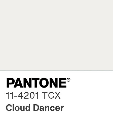
PANTONE 11-4201 Cloud Dancer (2026)
A billowy, balanced, and serene white. In an era of high digital noise, this shade champions calm, spaciousness, and quiet reflection, encouraging businesses to adopt clean minimalism, open layouts, and distraction-free user experiences.
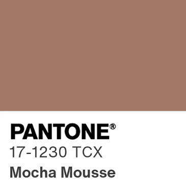
PANTONE 17-1230 Mocha Mousse (2025)
A warming, delectable brown hue that answers consumer desire for comfort, grounded authenticity, and quiet luxury.
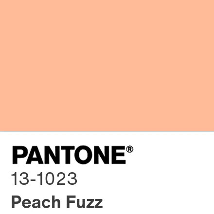
PANTONE 13-1023 Peach Fuzz (2024)
A velvety, gentle peach shade designed to evoke warmth, community, sharing, and modern human connection.
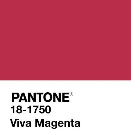
PANTONE 18-1750 Viva Magenta (2023)
A pulsating, fearless crimson-red celebrating boundary-pushing creativity and self-expression.
Applying Trend Colours to Your Brand
While your core brand identity should remain timeless, incorporating complementary trend shades into promotional campaigns, seasonal landing pages, or social media templates keeps your business feeling modern, culturally relevant, and visually captivating.
Aligning Your Palette with Your Target Audience
To ensure your colour choices are working for your business rather than against it, run through this quick evaluation:
- Who is your ideal client? High-end corporate boards respond to deep navy, slate, and gold; eco-conscious consumers look for earthy greens and warm neutrals; creative consumers respond to bold purples, corals, and magentas.
- What action do you want them to take? High-contrast accent colours (like vibrant orange, cobalt, or coral) make high-converting Call-to-Action (CTA) buttons on websites.
- Is there sufficient accessibility? Always ensure text and background colours have high contrast ratios (minimum 4.5:1 for standard text under WCAG standards) so your site is clear and legible on every screen.
By harmonizing colour psychology with strategic web design, your brand won’t just look visually polished—it will consistently attract, engage, and convert your ideal audience.
Is your current colour palette speaking directly to your dream clients, or is it sending the wrong message?
At Web Marketing Angels, we don’t just design eye-catching logos and websites—we build strategic visual identities grounded in proven consumer psychology, market positioning, and high-converting design standards. Whether you are launching a new venture, undergoing a complete brand refresh, or looking to optimize your website for maximum conversions, our team is here to help your business stand out and thrive.
Ready to elevate your brand identity? Contact Web Marketing Angels today or call our friendly team on 1300 859 862 for an obligation-free brand and website audit. Let’s create a look that commands attention and converts traffic into loyal clients!